Book Cover Contest

Recently, I ran into an advertisement for a book cover contest. I don’t usually try entering contests. The need for structured competition feels a tad bit ridiculous to me. I have nothing against people that enjoy competition. It’s just not for me. I prefer keeping an internal tally of my improvement over what I’ve done before. Competing with people I believe are my betters in my mind, can sometimes motivate me.


Keeping up motivation through a competition is the hard part. The way it’s supposed to work, doesn’t work for me. Nonetheless, I followed the traditional structure. First, I amped myself up with the thought that I would win. Every time I wanted to stop, I braced on that mantra, I’m going to win. And there was always fear. If I didn’t win, I would be crushed, and I’d never want to do something like that again.

contest web

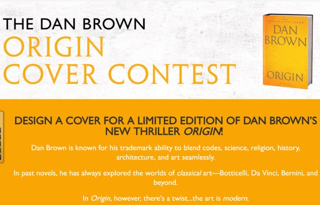
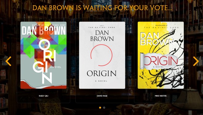
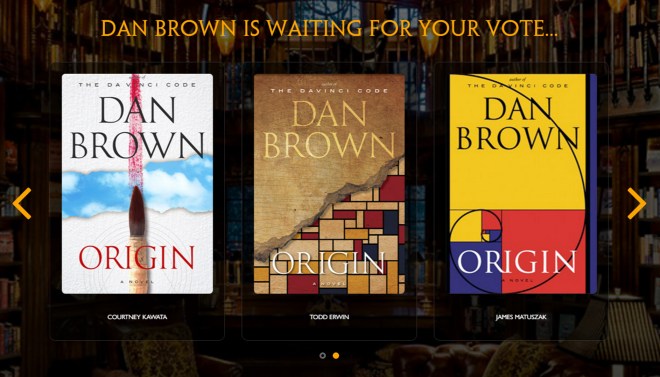
Anyway, I had to design a special edition book cover for Dan Brown’s next book, Origin. The rules were simple. Include some text and make it the right size. Choosing what cover design to make was the difficult thing. If I supremely made a cover of something they didn’t want, it wouldn’t matter how good it looked. I could design anything I wanted. Making something they wanted as the cover was the hardest part. I needed details on the book. Those were sparse. Origin is the sequel to Inferno. Origin was about modern art. That was everything we got.

Day 1

In addition to entering the contest, I wanted to learn Adobe Illustrator. I had two months to submit a book cover. I choose what to make. I decided Origin was about something Biblical like the other books in the series. I knew the protagonist would be Robert Langdon. And modern art. I wanted to make a cubist picture of a guy for the cover. Then add the text and block out behind it, like a reversed redaction.

Day 2

I started. First, I made a reference image from stock I found on Unsplash.

day-4

I drew shapes.

day 5

I merged and divided shapes so everything was at a depth of one layer.

6

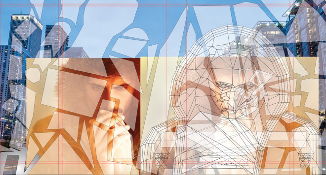
I colored the squares.

7

I made shadows.

8

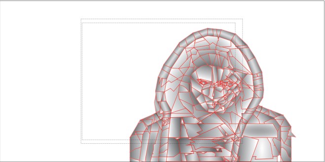
Finally, I blocked out the text.

9

I combined all the layers.

10

Ultimately, I didn’t become a finalist. I learned a lot and probably won’t enter another book cover design contest again. My cover was over-designed. I frequently over-complicate things. The focus wasn’t the legibility of the text. I focused too much of the cover picture. If I make another book cover, I’ll fix all that stuff. And my design wasn’t what they wanted.


These are the finalists.

finalists 2finalists 1

Thank for reading.


GK

subscribe button

Photoshop: My Best is Yet to Come


This is a gallery of everything I’ve done so far. This is basically my way of procrastinating and not doing the work of writing. This series on Photoshop is wandering a little too far from the goal of this blog.  Most of these are from an up-coming anthology of my best writing in Remember. So here’s the gallery. Enjoy and click through to my Deviant Art page for full resolution.

This slideshow requires JavaScript.


GK

This slideshow requires JavaScript.

subscribe button

How to Learn Photoshop for Bookcovers


Photoshop is the professional standard for book covers. The question used to be if Photoshop CC was worth the nearly absurd cost. For the first time desktop software leasing made sense. 6,000 bucks is unbelievably expense. Adobe’s Photoshop CC is now 19 dollars a single month or 10 dollars every month for a year.

Photoshop_icon.svg

The big question is do you really need Photoshop CC or will the consumer version, Photoshop Elements, be good enough? Photoshop Elements is missing a few things that I think separate something that looks professional and something that looks shabby. What features am I talking about? Blend modes and the opacity slider. The blend modes allow more control in the way image layer over each other. If composting two images is required, blend modes are huge. The opacity slider controls how strongly one image imposes on everything below. Another big one the text kerning or fine tuning the spacing and position of each letter. Almost every single book cover I’ve ever seen use kerning, stretching letter, composting, and blending tweaks.


stock images

Making a book cover requires a few things. Access to Photoshop, a book cover idea, a repertoire of Photoshop effects, and a collection of stock photos that can be used for a cover. The last one is the toughest if graphic design isn’t your day job. Look at this list over on Medium for free stock image sources. Check the usage rights always. Watch a ton of Youtube videos to build a repertoire of Photoshop effects. Look at an earlier blog post for book cover ideas. Now we have everything we need.


Photoshop isn’t a daunting thing to learn. The entire process is basically the tweaking and playing around with sliders governing everything in there. You can be artistic or not. It all comes down to comparing an image before and after every change that’s made. What looks better to your eye and such.


I’ll show something that I stumbled into while trying to do something else. I had this image. I wanted to add another image around the color gradations (one color changes to another). I tried making a highly detailed mask by copying the picture and getting the difference from the original slightly shifted. That got me something strange. It looked like an interference pattern.


I tried removing the color from both. Didn’t work. Then I started playing around. Trying every possible combination of color and no color, each blend mode, opacity level. Something along the way looked interesting. That’s how this happened. More details here.


In two weeks, I’ll post a gallery of everything I’ve done so far, photo-manipulations and book covers. Another fiction post coming up soon.


Later guys.


GK

subscribe button