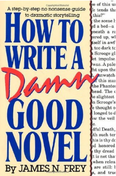
I finished reading How to Write a Damn Good Novel by James N. Frev. It gave me things to learn I frequently ignore. A few tips redefined a few things like what to explain and what to leave out. The book is about writing dramatic stories, not the literary I frequently write. My literary pieces have a strong dramatic storyline and a deep internal conflict. The lessons learned are invaluable in improving my writing.
The character must be fathomable. Explain their motivations, character attributes, and decision-making process. My writing process directly opposes this requirement. I establish a new thought pattern in my head to match the character I’m writing. That’s only possible because I’ve spent nearly a decade and a half mediating. Acting out physical traits isn’t something my diseased body is capable of. That mental model is as close as I can get. Thinking like your character makes the motivations, character attributes, and decision-making process apparent and self-explanatory. It should be second nature. Stuff that doesn’t feel wrong as that character. Everything except that particular action feels wrong. Putting that on paper isn’t tricky at all, except I never know how much to put down. This book helped a lot. Include everything required to understand the characters.
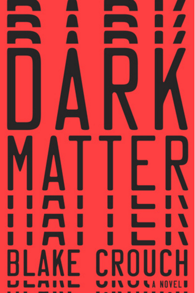
Each scene should be a story in its own right. The scenes should have all the pieces of a story. A beginning setting up the conflict. A middle of rising tension. Finally a build up to the conclusion. When a book has that it’s difficult to stop reading. A perfect example is Dark Matter by Blake Crouch. It followed that pattern. Each scene was a story in its own right.
There needs to be a connection of causality between scenes. Watch this, the best discussion on causality that appears in a feature film in my opinion. The events must require the events prior to lead up to them. A connects to B, then C. The web of causality must connect from one to the next. Again this is exemplified in Dark Matter. Of course, literary novels frequently forgo that rules. But getting things in line helps to justify those tangents literary is famous for.
Dialogue should also follow the structure of a story. No conflict in dialogue means it can be rewritten or scrapped. Standard conversations we have every day can easily be reduced to one summarizing sentence. We talk about this or that.
Sometimes things go down. You come away reeling and need to spew everything to someone you trust. Those are the sorts of conversations dialogue should be. I noticed that in my first novel. The lunchroom conversations were boring to read but the arguments were impactful. Leaving out the daily dribble of conversation helped my story beyond measure.
Reading How to Write a Damn Good Novel and Dark Matter in a basic requirement for any writer. The theory expressed in the book about writing is exemplified in Dark Matter. Read both and get back to me. Kidding.
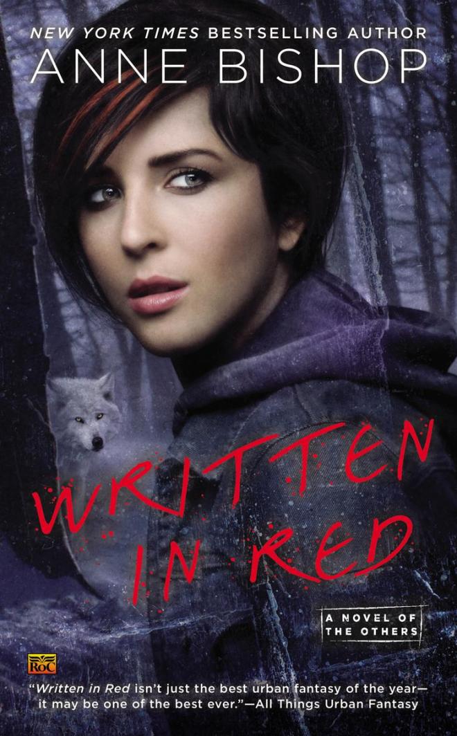
I came upon a series a few years ago. It’s a series called The Others, written by Anne Bishop. For a long time, I’ve been thinking what about the series makes me coming back, except having purchased the entire series up to now. A lot of things can keep me coming back, but everything from before doesn’t work with this series. The characters aren’t particularly interesting. The world in the book isn’t that different from real life. Nothing is really there from a first glance.
Hopefully, this blog post will help me figure out what’s the appeal of The Others. Written in Red was the first book I’ve read that starts with an introduction that says the history of a fictional world. It basically says alongside humans there was another comparable top predator. Bishop refers to these other people as the Others, Earth Natives, or terra indigene. Well, the Earth Natives control the natural resources and humans make stuff. Everything humans have is basically rented or purchased from the terra indigene. One area in Europe is rightfully under human control without owing the Others anything.
I’ll dissect that idea here. The terra indigene are creatures that take on the form of other top predators they encounter. Most of them have a human and animal form. Some can become smoke. Others shift into the elements. And others can turn into anything at will. This relates to skinwalkers in our world, people of myth that can supposedly take the shape of animals. I equate the Others to Native Americans who have way more power due to their ability to be stronger and just as smart. What happens if the invaders or early explorers found people much more dangerous than themselves? Something very similar to the world of the Others happens.
This dynamic sometimes gets interesting. The clash between the Others and humans is always there in the background, but it isn’t that big in my mind. That dynamic has appeared a few times in other stories. Basically, every vampire and werewolf story is like that. I don’t really like that monster genre. Where the protagonist is a vampire or werewolf.
In the first book, Written in Red the moment that got me in was the nature of the cassandra sangue or blood prophet. Some girls and women have the ability to tell prophecies after they’re cut. That was new to this genre. After cutting, they speak and experience euphoria or hold it in to remember the vision and feel the pain of the cut. That euphoria bugged me for a little bit. I decided that was plain fiction. One such person, Meg is the protagonist of this story.
The combination of those two storylines effectively drives the story forward. Each book delves into a different aspect of those concepts. A series exploring the same facets of something in each book quickly grows repetitive. I haven’t read any adult series, but that makes sense based on the other series I’ve read.
Written in Red was about Meg escaping the compound and finding work with the Others. People like Meg, cassandra sangue were allowed to be held against their will by benevolent caretakers to help them survive their addiction to cutting and the euphoria. Those rules didn’t prohibit cutting the girls to make a profit by selling prophecies/cuts. Basically, the rich wanted that to continue, so they had their lobbyists pressure the government. Meg escaped one of those facilities. Most cassandra sangue weren’t exposed to the outside world so living outside was difficult.
Bishop adds new jargon throughout her books. I found that interesting as a writer. How should I introduce new words through fiction? The learning curve required probably wouldn’t work with how I write, but seeing it for real was something. The first one was A walk on the wild side, basically an intimate liaison between a human and a human form terra indigene.
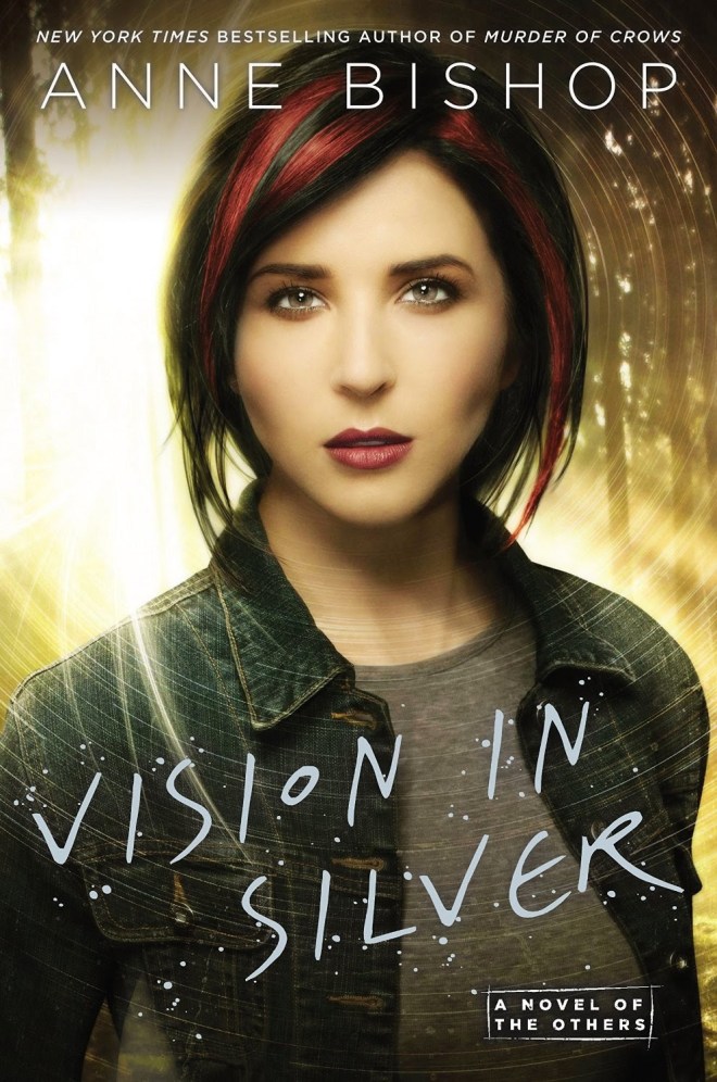
The storyline was a group of mercenaries went after Meg at the courtyard of the Others. Meg’s visions alerted them to the attack. Premonitions are an effective way to drive stories forward. Each book has them in different lights. In Written in Red, Meg spoke aloud her visions and other people interpreted the few words she spoke. In the second book, Murder of Crows, Meg dreamed her visions first. After cutting, she held in the vision and did everything she needed to do to save the most people. The third book was frustrating. Vision in Silver didn’t show the full prophecies. The bits and pieces we got were impossible to decipher until it actually came true. Right now, I’m reading book four, Marked in Flesh. Meg uses cards to reveal prophecy and other cassandra sangue bolster her abilities.
Murder of Crows is about two drugs, feel good and gone over wolf. Both are the same drug. The Others get feel good, a downer. Humans get gone over wolf, an upper for aggression and courage. Those drugs egged humans on to kill a group of Others that were shifted to Crows, hence the title. A group of people attack the Others’ courtyard like in book #1. Bishop made the similarity between the euphoria cassandra sangue felt and sexual pleasure. The villain drew me in. She was beyond convinced that the Others behaved like humans. A sexy body didn’t affect the others in any way. They didn’t find thin people appetizing, except in rare occasions. Her behavior was strange to them, and that cracked me up. I know I’m strange, hence the moniker radical.
Vision in Silver was about finding a way for cassandra sangue to in live the outside world. The other plot was about the rising friction between the humans and others. Somehow jewels financing the human uprising got into the hands of the Others, and people wanted it back. The Others are more deadly than people can imagine.
Marked in Flesh is the first real attack on the Others. The events leading up to and after the event are chronicled. You can guess what happens when a weaker force underestimates and attacks a stronger and more vicious force. Again, prophecy pushes the story forward.
A few things about the series bug me. The shifter story element seems all too familiar in this genre of urban fantasy. Sometime I should probably read the most successful series in this genre, The Twilight Saga. Haven’t had the pleasure yet, but eventually. The cutting experience is very different from reality in some ways and similar in others. Euphoria doesn’t result, and cutting isn’t as it seems in the book. Cutting is a response to some internal frequently psychological occurrence. A lot of unnecessary details are abundant. I doubt we need to read the characters changing between boots and indoor shoes every time they enter a building. The plethora of characters bugs me. It seems like in every book, a handful of characters just appear. If each character was new, dynamic, and transformative that would be something. The characters, except a few, seem like filler or a different name to use. Those flat characters aren’t even described frequently, externally or internally. Each book assumes you remember quite a lot about the characters, but the books come out months apart. I know a few books down the line, I’ll pull the ejection seat.
Anne Bishop does a few good things. There are a ton of subplots. Something is always going on. The descriptions of the buzzing, tingling, and prickling skin are effective as a divining rod to find the focus of a prophecy. Different characters are used as the point of view for different sections of the book, from chapters to a few lines. Meg’s battle with addiction is interesting, because it doesn’t exist exactly like that in real life. The basis is probably chemical addiction like smoking. I wish that so many Native Americans weren’t wiped out during the settlement of the world. The native people weren’t doing anything wrong, and we needlessly eliminated them in mass numbers. Maybe the world of the Others is how things could’ve been. The aspect of writing simply and getting complex ideas across interests me. Also, the way Bishop manages to put a sinister light on the most basic interactions.
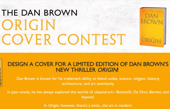
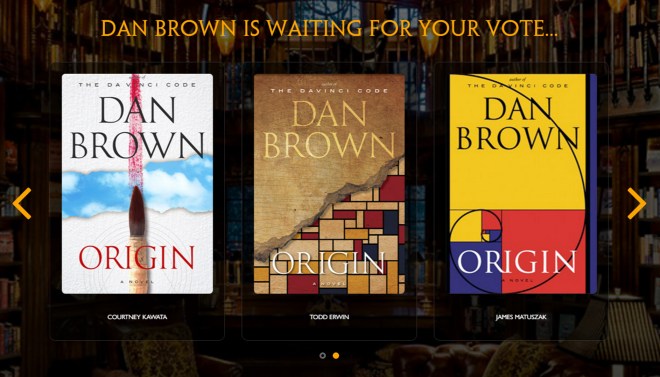
Recently, I ran into an advertisement for a book cover contest. I don’t usually try entering contests. The need for structured competition feels a tad bit ridiculous to me. I have nothing against people that enjoy competition. It’s just not for me. I prefer keeping an internal tally of my improvement over what I’ve done before. Competing with people I believe are my betters in my mind, can sometimes motivate me.
Keeping up motivation through a competition is the hard part. The way it’s supposed to work, doesn’t work for me. Nonetheless, I followed the traditional structure. First, I amped myself up with the thought that I would win. Every time I wanted to stop, I braced on that mantra, I’m going to win. And there was always fear. If I didn’t win, I would be crushed, and I’d never want to do something like that again.
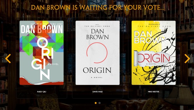
Anyway, I had to design a special edition book cover for Dan Brown’s next book, Origin. The rules were simple. Include some text and make it the right size. Choosing what cover design to make was the difficult thing. If I supremely made a cover of something they didn’t want, it wouldn’t matter how good it looked. I could design anything I wanted. Making something they wanted as the cover was the hardest part. I needed details on the book. Those were sparse. Origin is the sequel to Inferno. Origin was about modern art. That was everything we got.
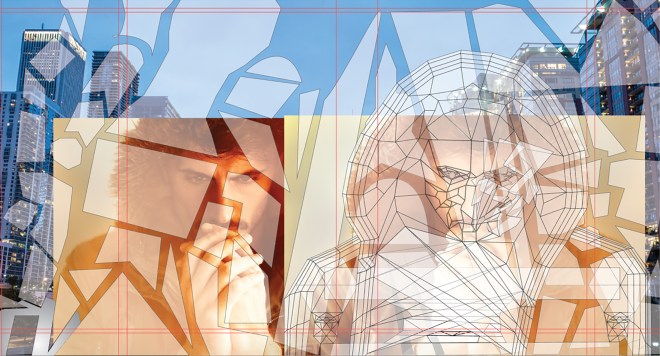
In addition to entering the contest, I wanted to learn Adobe Illustrator. I had two months to submit a book cover. I choose what to make. I decided Origin was about something Biblical like the other books in the series. I knew the protagonist would be Robert Langdon. And modern art. I wanted to make a cubist picture of a guy for the cover. Then add the text and block out behind it, like a reversed redaction.
I started. First, I made a reference image from stock I found on Unsplash.
I drew shapes.
I merged and divided shapes so everything was at a depth of one layer.
I colored the squares.
I made shadows.
Finally, I blocked out the text.
I combined all the layers.
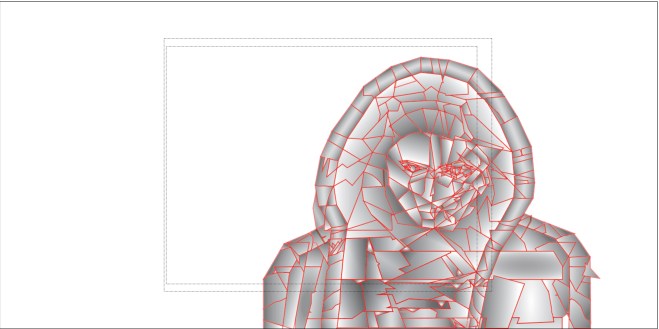
Ultimately, I didn’t become a finalist. I learned a lot and probably won’t enter another book cover design contest again. My cover was over-designed. I frequently over-complicate things. The focus wasn’t the legibility of the text. I focused too much of the cover picture. If I make another book cover, I’ll fix all that stuff. And my design wasn’t what they wanted.
Larry Brooks is a published author that has writing classes/workshops. In Story Engineering, he shows us what he teaches his students about writing fiction. Apparently, writing a screenplay is very easy in comparison. Books out there detail the rules required in an acceptable screenplay. Larry Brooks has brought that over to fiction writing. If you ignore the condescension of organic writes, the book brings a needed insight to novel writing.
Story Engineering starts with an argument against the formulaic nature of planning out a story using his components. The difference between art and putting matching things into a formula is the whole is greater than the sum of its parts. I wasn’t sure exactly what that meant while reading it. That’s one of the few things not explained in Story Engineering. I figured out a possible explanation. The various story elements, concept, story structure, character, theme, writer’s voice, and scene construction have a synergy between them. Each element builds on another. For example, first person, solitary confinement, weak mental state, and being alone is inhumane. With first person, we are with the inmate at all times. There’s minimal interaction with other people. Add the weak mental state and there’s a compelling story. Add examples of what other inmates in solitary confinement come out as. That makes a pretty good story right?
Concept is the central question of the story. Story structure is the pacing of the story. The author does a really good job of getting this point across through the book. What plot event should happen at certain points throughout the story? Several movies and books are discussed as examples. Every book and movie I remember follows the plot events. I’m not sure about the timing yet.
Character is presented as a personality selector you would use in The Sims. Different characteristics that can be tweaked to show the universality of humanity. Figuring out how each characteristic affects the others is where the art part comes in. Then the character arc. That was completely new to me.
I use a few lines of research to understand how characters operate. First, observing people and imagining what goes through their heads. Talking to people and looking for the motivations. Deeply analyzing my psyche through meditative practice. And method acting in my head. What would this character do if that happened?
Theme is the meaning behind the story. The story can give an opinion or explore a question. Figuring out what to say helps put it into the novel.
Writer’s voice is something that needs to be discovered through writing and trying different things. Scene construction states each scene has a mission. The scene needs to be short enough to accomplish its mission.
Reading Story Engineering will forever change my novel writing. I was already close, and now I get it for the first time. Larry Brooks knows his stuff. Great book Mr. Brooks.
This is a gallery of everything I’ve done so far. This is basically my way of procrastinating and not doing the work of writing. This series on Photoshop is wandering a little too far from the goal of this blog. Most of these are from an up-coming anthology of my best writing in Remember. So here’s the gallery. Enjoy and click through to my Deviant Art page for full resolution.
Photoshop is the professional standard for book covers. The question used to be if Photoshop CC was worth the nearly absurd cost. For the first time desktop software leasing made sense. 6,000 bucks is unbelievably expense. Adobe’s Photoshop CC is now 19 dollars a single month or 10 dollars every month for a year.
The big question is do you really need Photoshop CC or will the consumer version, Photoshop Elements, be good enough? Photoshop Elements is missing a few things that I think separate something that looks professional and something that looks shabby. What features am I talking about? Blend modes and the opacity slider. The blend modes allow more control in the way image layer over each other. If composting two images is required, blend modes are huge. The opacity slider controls how strongly one image imposes on everything below. Another big one the text kerning or fine tuning the spacing and position of each letter. Almost every single book cover I’ve ever seen use kerning, stretching letter, composting, and blending tweaks.
Making a book cover requires a few things. Access to Photoshop, a book cover idea, a repertoire of Photoshop effects, and a collection of stock photos that can be used for a cover. The last one is the toughest if graphic design isn’t your day job. Look at this list over on Medium for free stock image sources. Check the usage rights always. Watch a ton of Youtube videos to build a repertoire of Photoshop effects. Look at an earlier blog post for book cover ideas. Now we have everything we need.
Photoshop isn’t a daunting thing to learn. The entire process is basically the tweaking and playing around with sliders governing everything in there. You can be artistic or not. It all comes down to comparing an image before and after every change that’s made. What looks better to your eye and such.
I’ll show something that I stumbled into while trying to do something else. I had this image. I wanted to add another image around the color gradations (one color changes to another). I tried making a highly detailed mask by copying the picture and getting the difference from the original slightly shifted. That got me something strange. It looked like an interference pattern.
I tried removing the color from both. Didn’t work. Then I started playing around. Trying every possible combination of color and no color, each blend mode, opacity level. Something along the way looked interesting. That’s how this happened. More details here.
In two weeks, I’ll post a gallery of everything I’ve done so far, photo-manipulations and book covers. Another fiction post coming up soon.
Book covers are the first thing any potential reader sees. A book shouldn’t be judged by it’s cover, but first impressions are really important. I’m writing this to explore my ideas about how to decide what should be on a book cover.
I learned a lot by watching these videos from Chip Kidd. He talked about a few theories of graphic design. Don’t put a word in text and show a picture of the same thing.
Mystery or clarity. The cover should gently nudge a reader in one direction or clearly show what the book is about. Carefully decide on a balance.
The final video is a collection of book titles, book descriptions, and cover iterations.
Also, keep in mind, the cover should fit the conventions of the genre. The advice I’ve heard is go to a library, find a lot of books in your genre, and identify trends. I’ll give the covers of books I’ve read and what I think are the conventions for each.
Science Fiction: Frequently shows something that’s different in the world that’s created inside. Basically, the story element that’s makes it Science Fiction. Sans-serif font.
Fantasy: The person or object that makes the book fantasy. Frequently a person. Sans and Serif fonts.
Thriller: Person or text. Big font. High contrast. Simple lettering usually.
Young Adult: Sans. One main graphic or image. Background that isn’t too distracting. Clear images.
Romance: Two people together or something symbolizing love. Slightly interesting font.
Literary: Interesting text. Simple background. Setting, object, or overall idea.
Fiction: Person, place, or thing of focus in the story.
Mystery: Something that relates to the scene of the crime, victim, or perpetrator.
Non-fiction: Person, place, or idea the book is about.
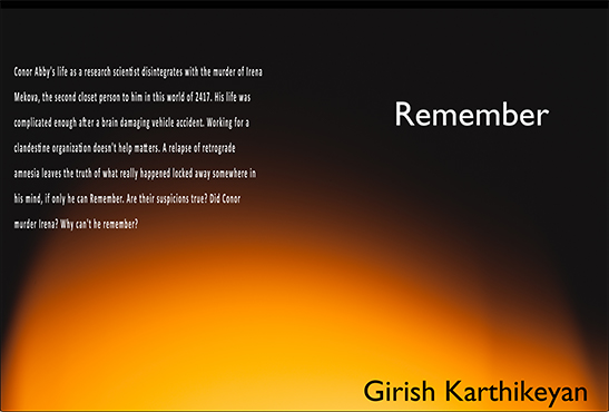
Remember is in need of a new cover. I made one that doesn’t look right. That was before researching anything and based on the covers of other Science Fiction books I’ve read. It was totally free and I made it myself. I used free graphic design software available easily on the web. I used Inkscape, something very similar to Adobe Illustrator.
I went through the built-in tutorials that guide you through the tools available in the app. That was more than what I needed for a simple cover. I knew the results wouldn’t look professional, but it would be close enough. I would first need to find a stock photo. With Inkscape, I would add the title, author, and back description. I already wrote all of that. The best source for free stock images that can be left almost unchanged is Unsplash.com. They have lots of free images that can be used anywhere including print, physical output, or digital. I looked through hundreds searching for anything that could work. Going the free route without editing the pictures, it was really tough to find exactly what I was looking for. I also downloaded anything that I liked for future use.
Remember is about a guy that loses his identity. He tries to regain the person he was. I think this picture shows that. A person looking up at the stars. Stars are up in the abyss of outer space and could be thought to symbolize neurons. Star gazing could be thought of as a form of discovery.
I used the text tool to add the other components. The letter spacing sometimes required adjustment to make everything even.
I discovered a big problem. My protagonist is male and the silhouette is clearly female. I needed to cut out some areas of black and replace it with some part of the background. It’s much easier to do that in Photoshop. I used Inkscape. I drew shapes where the black needed to be removed. I copied the image and everything I drew. I deselected everything. I moved the drawn shapes over a place that matched the area I wanted to replace. Then I selected the image followed by the drawn shape. I went to: Object > Clip > Set. That cut the shape outlines from the background image. I repositioned the cutouts where the black had to be removed.
That got me this. Second attempt but good I think. I didn’t look like a book cover from a publishing house still.
I also made this alternate cover with a picture I found. I counter shaded the text.