Black Swan: Aspects of Story


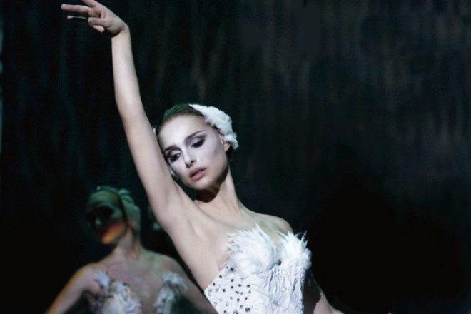
I just watched Black Swan. It’s a movie that came out way back in 2010. I wasn’t ready to watch it at that time. But anyway, I liked watching it. The story is about a ballerina named Nina learning how to be the lead in Swan Lake, White Swam/Black Swan.

LV1F4983.CR2

I didn’t know the story of Swan Lake before hearing it in the movie. It’s about a girl that’s turned into a swan, the White Swan. Finding love to escape the curse. She finds a Prince to love. Before he can turn her back, he is seduced by her evil doppelganger, the Black Swan. The White Swan is heartbroken. Instead of living as a swan without her love, she commits suicide.

black swan

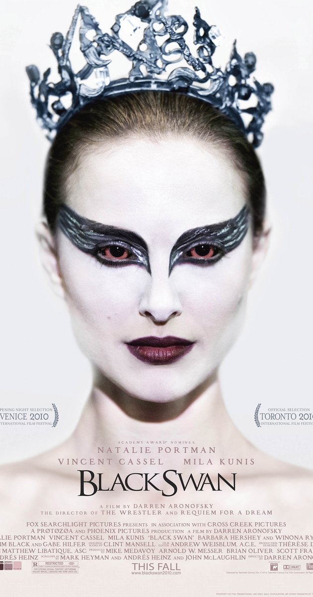
According to the movie, the White Sawn requires perfect ballet. Nina is very good at precision and the perfect ballet required for that role. The Black Swan requires a more natural style. Nina can’t allow ballet to happen. She can’t let herself go and simply respond to the music. She can’t be out of control. That’s the part she can’t do.

mother

The movie is about learning to let go and batting her self-injuring tendencies. Nina unconsciously harms herself and imagines perfecting herself by throwing away unacceptable parts of herself. I think that stems from her desire to be loved by her mother. If Nina isn’t perfect, she doesn’t get affection, just a strong hand controlling her. Anyway, Nina’s symptoms get worse with the pressure on her.

Nina

Nina is jealous of the new ballerina in the company, Lily. I liked Lily’s character much more than the troubled Nina. Lily is a natural. She let’s herself go in the movement of the dance. I enjoyed the unself-conscious way she moves through the world. I hoped a little of Lily would rub off on Nina.

IMG_1338.CR2

I wanted a different storyline than what was presented to us. I wished Nina and Lily built a relationship, so Nina would learn what she needed to. That sadly didn’t happen. Events evolved in a different way that I didn’t like much.


Black Swan was a great movie. It made me think, and I love movies like that. Isn’t it startling how deeply our parents can influence our future self’s. It even more fascinating that we can’t remember the formative time before the age of two and a half years. Those few years greatly determine our personalities.


Have you seen Black Swan? What did you think?  


GKsubscribe button

Book Cover Contest

Recently, I ran into an advertisement for a book cover contest. I don’t usually try entering contests. The need for structured competition feels a tad bit ridiculous to me. I have nothing against people that enjoy competition. It’s just not for me. I prefer keeping an internal tally of my improvement over what I’ve done before. Competing with people I believe are my betters in my mind, can sometimes motivate me.


Keeping up motivation through a competition is the hard part. The way it’s supposed to work, doesn’t work for me. Nonetheless, I followed the traditional structure. First, I amped myself up with the thought that I would win. Every time I wanted to stop, I braced on that mantra, I’m going to win. And there was always fear. If I didn’t win, I would be crushed, and I’d never want to do something like that again.

contest web

Anyway, I had to design a special edition book cover for Dan Brown’s next book, Origin. The rules were simple. Include some text and make it the right size. Choosing what cover design to make was the difficult thing. If I supremely made a cover of something they didn’t want, it wouldn’t matter how good it looked. I could design anything I wanted. Making something they wanted as the cover was the hardest part. I needed details on the book. Those were sparse. Origin is the sequel to Inferno. Origin was about modern art. That was everything we got.

Day 1

In addition to entering the contest, I wanted to learn Adobe Illustrator. I had two months to submit a book cover. I choose what to make. I decided Origin was about something Biblical like the other books in the series. I knew the protagonist would be Robert Langdon. And modern art. I wanted to make a cubist picture of a guy for the cover. Then add the text and block out behind it, like a reversed redaction.

Day 2

I started. First, I made a reference image from stock I found on Unsplash.

day-4

I drew shapes.

day 5

I merged and divided shapes so everything was at a depth of one layer.

6

I colored the squares.

7

I made shadows.

8

Finally, I blocked out the text.

9

I combined all the layers.

10

Ultimately, I didn’t become a finalist. I learned a lot and probably won’t enter another book cover design contest again. My cover was over-designed. I frequently over-complicate things. The focus wasn’t the legibility of the text. I focused too much of the cover picture. If I make another book cover, I’ll fix all that stuff. And my design wasn’t what they wanted.


These are the finalists.

finalists 2finalists 1

Thank for reading.


GK

subscribe button

Photoshop: My Best is Yet to Come


This is a gallery of everything I’ve done so far. This is basically my way of procrastinating and not doing the work of writing. This series on Photoshop is wandering a little too far from the goal of this blog.  Most of these are from an up-coming anthology of my best writing in Remember. So here’s the gallery. Enjoy and click through to my Deviant Art page for full resolution.

This slideshow requires JavaScript.


GK

This slideshow requires JavaScript.

subscribe button

How to Learn Photoshop for Bookcovers


Photoshop is the professional standard for book covers. The question used to be if Photoshop CC was worth the nearly absurd cost. For the first time desktop software leasing made sense. 6,000 bucks is unbelievably expense. Adobe’s Photoshop CC is now 19 dollars a single month or 10 dollars every month for a year.

Photoshop_icon.svg

The big question is do you really need Photoshop CC or will the consumer version, Photoshop Elements, be good enough? Photoshop Elements is missing a few things that I think separate something that looks professional and something that looks shabby. What features am I talking about? Blend modes and the opacity slider. The blend modes allow more control in the way image layer over each other. If composting two images is required, blend modes are huge. The opacity slider controls how strongly one image imposes on everything below. Another big one the text kerning or fine tuning the spacing and position of each letter. Almost every single book cover I’ve ever seen use kerning, stretching letter, composting, and blending tweaks.


stock images

Making a book cover requires a few things. Access to Photoshop, a book cover idea, a repertoire of Photoshop effects, and a collection of stock photos that can be used for a cover. The last one is the toughest if graphic design isn’t your day job. Look at this list over on Medium for free stock image sources. Check the usage rights always. Watch a ton of Youtube videos to build a repertoire of Photoshop effects. Look at an earlier blog post for book cover ideas. Now we have everything we need.


Photoshop isn’t a daunting thing to learn. The entire process is basically the tweaking and playing around with sliders governing everything in there. You can be artistic or not. It all comes down to comparing an image before and after every change that’s made. What looks better to your eye and such.


I’ll show something that I stumbled into while trying to do something else. I had this image. I wanted to add another image around the color gradations (one color changes to another). I tried making a highly detailed mask by copying the picture and getting the difference from the original slightly shifted. That got me something strange. It looked like an interference pattern.


I tried removing the color from both. Didn’t work. Then I started playing around. Trying every possible combination of color and no color, each blend mode, opacity level. Something along the way looked interesting. That’s how this happened. More details here.


In two weeks, I’ll post a gallery of everything I’ve done so far, photo-manipulations and book covers. Another fiction post coming up soon.


Later guys.


GK

subscribe button

What Should My Novel’s Cover Look Like?


Book covers are the first thing any potential reader sees. A book shouldn’t be judged by it’s cover, but first impressions are really important. I’m writing this to explore my ideas about how to decide what should be on a book cover.


I learned a lot by watching these videos from Chip Kidd. He talked about a few theories of graphic design. Don’t put a word in text and show a picture of the same thing.

Mystery or clarity. The cover should gently nudge a reader in one direction or clearly show what the book is about. Carefully decide on a balance.

The final video is a collection of book titles, book descriptions, and cover iterations.

Also, keep in mind, the cover should fit the conventions of the genre. The advice I’ve heard is go to a library, find a lot of books in your genre, and identify trends. I’ll give the covers of books I’ve read and what I think are the conventions for each.

Science Fiction: Frequently shows something that’s different in the world that’s created inside. Basically, the story element that’s makes it Science Fiction. Sans-serif font.

Fantasy: The person or object that makes the book fantasy. Frequently a person. Sans and Serif fonts.

Thriller: Person or text. Big font. High contrast. Simple lettering usually.

Young Adult: Sans. One main graphic or image. Background that isn’t too distracting. Clear images.

Romance: Two people together or something symbolizing love. Slightly interesting font.

Literary: Interesting text. Simple background. Setting, object, or overall idea.

Fiction: Person, place, or thing of focus in the story.

Mystery: Something that relates to the scene of the crime, victim, or perpetrator.

Non-fiction: Person, place, or idea the book is about.


I hope this helps. Graham Kar out.


GK

subscribe button

The Most Basic Cover You Can Make


Remember is in need of a new cover. I made one that doesn’t look right. That was before researching anything and based on the covers of other Science Fiction books I’ve read. It was totally free and I made it myself. I used free graphic design software available easily on the web. I used Inkscape, something very similar to Adobe Illustrator.

inkscape

I went through the built-in tutorials that guide you through the tools available in the app. That was more than what I needed for a simple cover. I knew the results wouldn’t look professional, but it would be close enough. I would first need to find a stock photo. With Inkscape, I would add the title, author, and back description. I already wrote all of that. The best source for free stock images that can be left almost unchanged is Unsplash.com. They have lots of free images that can be used anywhere including print, physical output, or digital. I looked through hundreds searching for anything that could work. Going the free route without editing the pictures, it was really tough to find exactly what I was looking for. I also downloaded anything that I liked for future use.

silhoutte into space

Remember is about a guy that loses his identity. He tries to regain the person he was. I think this picture shows that. A person looking up at the stars. Stars are up in the abyss of outer space and could be thought to symbolize neurons. Star gazing could be thought of as a form of discovery.


I used the text tool to add the other components. The letter spacing sometimes required adjustment to make everything even.

I discovered a big problem. My protagonist is male and the silhouette is clearly female. I needed to cut out some areas of black and replace it with some part of the background. It’s much easier to do that in Photoshop. I used Inkscape. I drew shapes where the black needed to be removed. I copied the image and everything I drew. I deselected everything. I moved the drawn shapes over a place that matched the area I wanted to replace. Then I selected the image followed by the drawn shape. I went to: Object > Clip > Set. That cut the shape outlines from the background image. I repositioned the cutouts where the black had to be removed.

That got me this. Second attempt but good I think. I didn’t look like a book cover from a publishing house still.

I also made this alternate cover with a picture I found. I counter shaded the text.

altcover3

Later Blog Readers.


GK

subscribe button