What Should My Novel’s Cover Look Like?


Book covers are the first thing any potential reader sees. A book shouldn’t be judged by it’s cover, but first impressions are really important. I’m writing this to explore my ideas about how to decide what should be on a book cover.


I learned a lot by watching these videos from Chip Kidd. He talked about a few theories of graphic design. Don’t put a word in text and show a picture of the same thing.

Mystery or clarity. The cover should gently nudge a reader in one direction or clearly show what the book is about. Carefully decide on a balance.

The final video is a collection of book titles, book descriptions, and cover iterations.

Also, keep in mind, the cover should fit the conventions of the genre. The advice I’ve heard is go to a library, find a lot of books in your genre, and identify trends. I’ll give the covers of books I’ve read and what I think are the conventions for each.

Science Fiction: Frequently shows something that’s different in the world that’s created inside. Basically, the story element that’s makes it Science Fiction. Sans-serif font.

Fantasy: The person or object that makes the book fantasy. Frequently a person. Sans and Serif fonts.

Thriller: Person or text. Big font. High contrast. Simple lettering usually.

Young Adult: Sans. One main graphic or image. Background that isn’t too distracting. Clear images.

Romance: Two people together or something symbolizing love. Slightly interesting font.

Literary: Interesting text. Simple background. Setting, object, or overall idea.

Fiction: Person, place, or thing of focus in the story.

Mystery: Something that relates to the scene of the crime, victim, or perpetrator.

Non-fiction: Person, place, or idea the book is about.


I hope this helps. Graham Kar out.


GK
subscribe button

The Most Basic Cover You Can Make


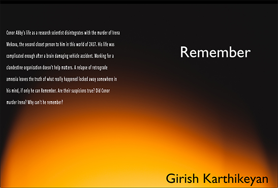
Remember is in need of a new cover. I made one that doesn’t look right. That was before researching anything and based on the covers of other Science Fiction books I’ve read. It was totally free and I made it myself. I used free graphic design software available easily on the web. I used Inkscape, something very similar to Adobe Illustrator.

inkscape

I went through the built-in tutorials that guide you through the tools available in the app. That was more than what I needed for a simple cover. I knew the results wouldn’t look professional, but it would be close enough. I would first need to find a stock photo. With Inkscape, I would add the title, author, and back description. I already wrote all of that. The best source for free stock images that can be left almost unchanged is Unsplash.com. They have lots of free images that can be used anywhere including print, physical output, or digital. I looked through hundreds searching for anything that could work. Going the free route without editing the pictures, it was really tough to find exactly what I was looking for. I also downloaded anything that I liked for future use.

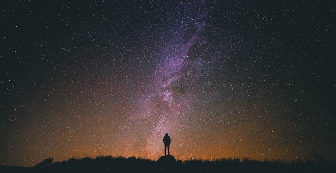
silhoutte into space

Remember is about a guy that loses his identity. He tries to regain the person he was. I think this picture shows that. A person looking up at the stars. Stars are up in the abyss of outer space and could be thought to symbolize neurons. Star gazing could be thought of as a form of discovery.


I used the text tool to add the other components. The letter spacing sometimes required adjustment to make everything even.

I discovered a big problem. My protagonist is male and the silhouette is clearly female. I needed to cut out some areas of black and replace it with some part of the background. It’s much easier to do that in Photoshop. I used Inkscape. I drew shapes where the black needed to be removed. I copied the image and everything I drew. I deselected everything. I moved the drawn shapes over a place that matched the area I wanted to replace. Then I selected the image followed by the drawn shape. I went to: Object > Clip > Set. That cut the shape outlines from the background image. I repositioned the cutouts where the black had to be removed.

That got me this. Second attempt but good I think. I didn’t look like a book cover from a publishing house still.

I also made this alternate cover with a picture I found. I counter shaded the text.

altcover3

Later Blog Readers.


GK

subscribe button